@dmonad I’ve had this kicking around for months, figured I’d at least (finally) put it out there; let me know what ya think. We talked forever and a day ago about doing some redesign work… I have some neat ideas. No timeline, obvs.
Critique is welcome, praise is perhaps less helpful, but I’ll take what I can get.
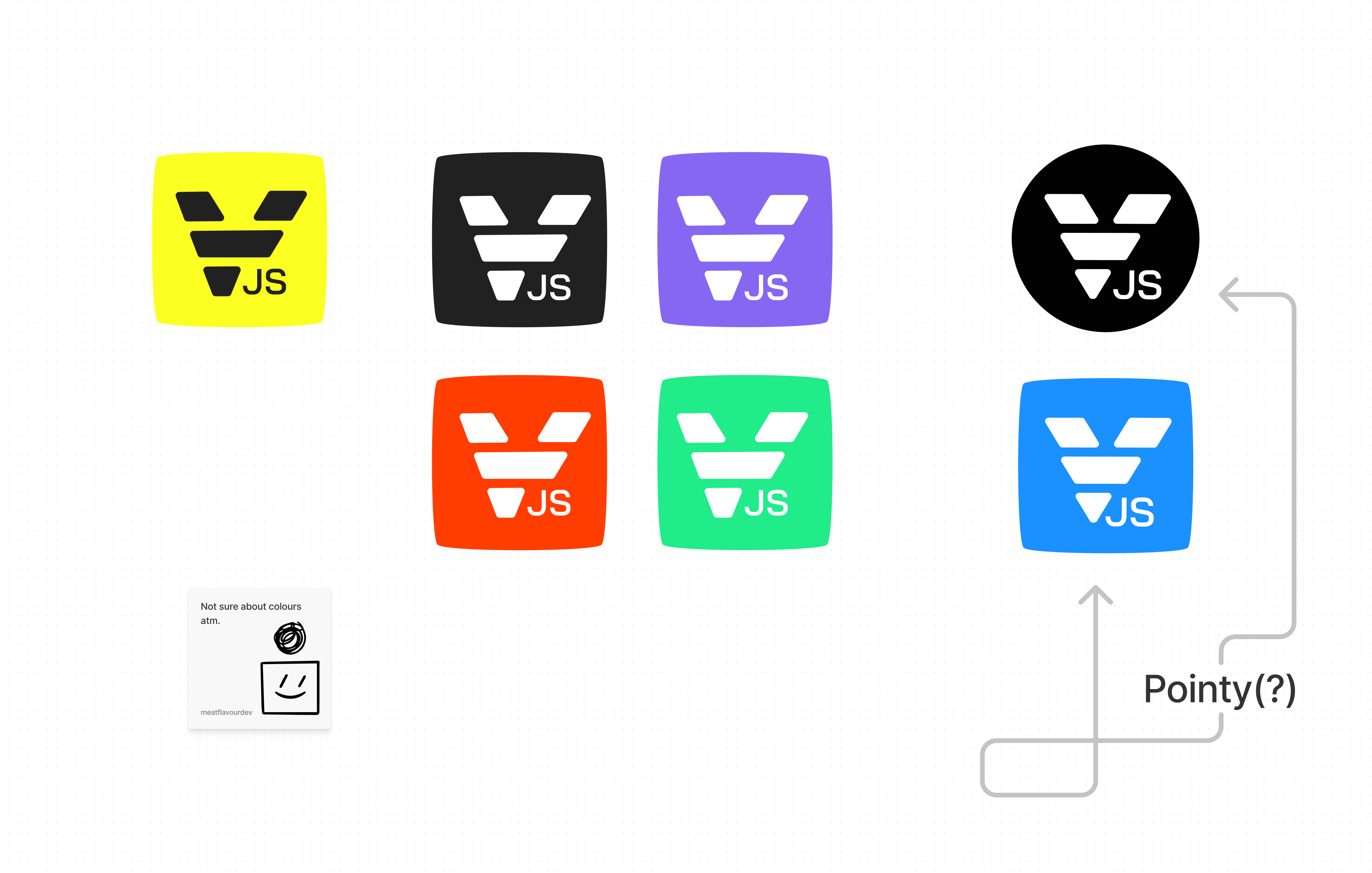
I dig the horizontal lines (evokes adidas-esque), however can’t help but see a V instead of Y.
With the current v13 logo (rebranded 1+ year ago?) the multi-colored nodes of the Y coming togther work nicely to symbolize a merge. Perhaps a small OCD thing, is that yellow + green don’t produce blue… but only just now noticed that.
Where were you when I had to design the logo? Thanks for this!
The idea of the Y was that it should symbolize two branches merging. I never was able to express that nicely. My first logo had a gradient that merged colors, but it looked too awful.
Your logo looks really cool, but as @ffd8 said, it really does look more like a V and it doesn’t carry the meaning of merging branches anymore.

 )
)